
Antiques + Modernism Winnetka wanted a different look this year. Without doing a total rebranding project, they wanted to make things look fresher. They also wanted to focus on photography from the show and showcase some of the work that dealers display.
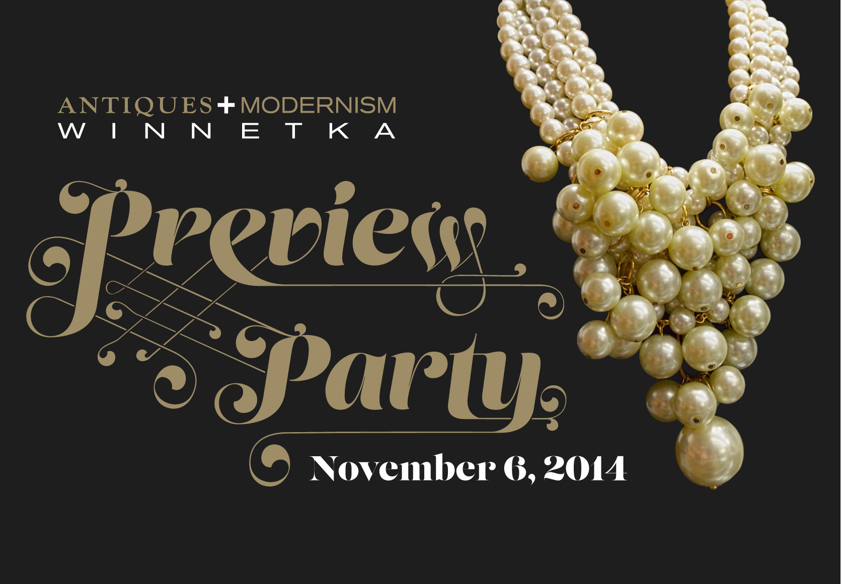
I chose a photo of an ornate pear necklace on a black background. I chose a typeface that was strong yet elegant and customized its ornamenture.
We picked a metallic ink that matched the colors in the necklace and altered the show's logo to include that color and white.